
Big news! Today, after seventeen years, we’re releasing an updated brand identity, which includes a new logo, colors, and font. You’ll see the new look anywhere we’re out in public, like our website, Facebook, and Twitter; very soon you’ll see it in all of our products, as well. We believe the new look better matches what we’ve become since 1999: a provider of thoughtful technology that modernizes aspects of the work of higher education, while better connecting scholars to each other and their institutions.
![]()
Since our founding in 1999, we’ve more or less stuck with the same spinning atom logo, although very recently we’ve slightly altered our colors—you can’t really blame us, they were brown and orange. But in the last few years we’ve changed quite a lot: we launched a new product for universities to help committee decision-making and started hewing more closely to the needs of faculty users. The old look started to chafe. The atom felt a bit scientific (we serve all disciplines, after all), and the orange and brown felt like a pair of pants we put on in a dorm room in 1999 and forgot to take off for almost two decades. Needless to say, it was time for a change.
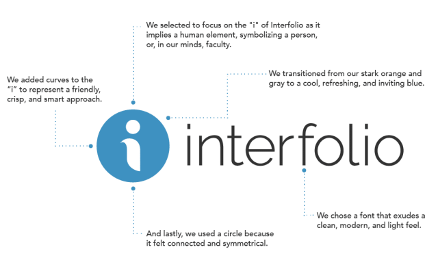
Our design goal was to better match how we look to our values and the users we serve. A small team inside the company worked to find something that appeared crisp, approachable, smart, friendly, and connected.

Compared with orange, the lighter blue is cool and refreshing, and the darker, grey-blue feels a bit collegiate. The sans serif font is deliberately clean, modern, and light.
The “i” of the logo, quite obviously, represents the company name, but it’s stylized with curves to appear friendly, and even slightly human. Our decision to use a letter form in the logo was inspired by illuminated manuscripts, which were instrumental in spreading ideas during the Middle Ages. We believe this modern take on the illuminated letter communicates a commitment to support the work that our scholarly users create.
We hope you like this new look and feel for Interfolio! Look out for more updates—like an updated look in our product and a brand-new website—as we continue to try to better serve our users in higher education with clean, modern, user-friendly technology.